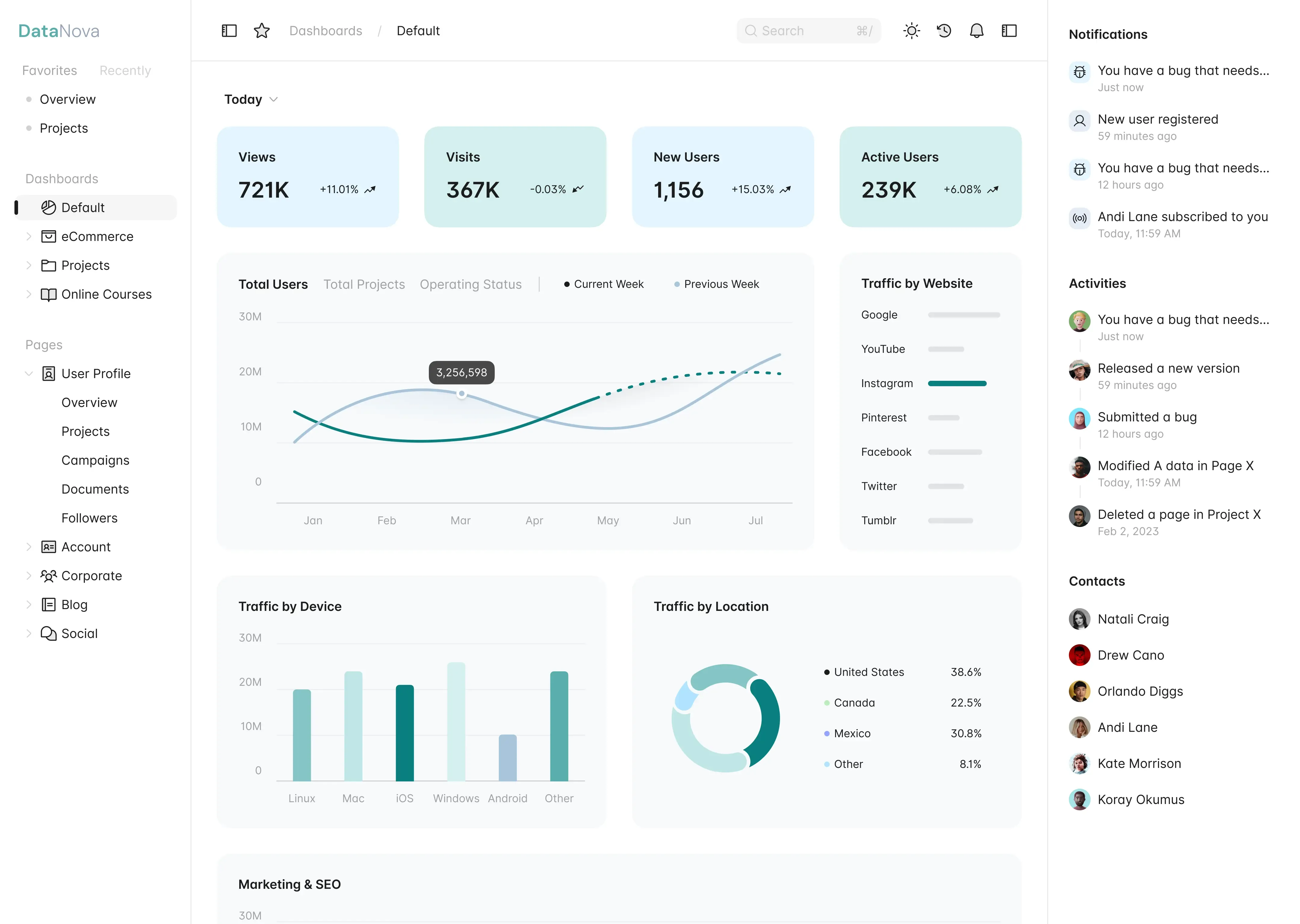
In the age of data, the ability to visualize information effectively is crucial for making informed decisions. Dashboards serve as powerful tools that allow users to monitor key metrics, track performance, and gain insights at a glance. With DataNova, creating custom dashboards in Excel has never been easier. This step-by-step guide will walk you through the process of building interactive, real-time dashboards that automatically update as your data changes.
Why use dashboards?
Dashboards provide a consolidated view of your data, allowing you to visualize trends, track performance, and make data-driven decisions. Here are some key benefits of using dashboards:
- Real-Time Insights: Dashboards can be set up to refresh automatically, providing you with the most current data at any moment.
- Enhanced Decision-Making: By visualizing data, you can quickly identify patterns and anomalies, leading to more informed decisions.
- Improved Communication: Dashboards can be shared with stakeholders, making it easier to communicate insights and performance metrics.
- Customization: You can tailor dashboards to meet your specific needs, focusing on the metrics that matter most to your organization.

Getting started with DataNova in Excel
Before diving into the dashboard creation process, ensure you have DataNova installed and your data ready. DataNova integrates seamlessly with Excel, allowing you to leverage its powerful analytics capabilities.
Step 1: Prepare your data
The first step in creating a custom dashboard is to prepare your data. Here’s how to do it:
- Collect Data: Gather all relevant data that you want to include in your dashboard. This could be sales figures, customer data, or any other metrics important to your business.
- Organize Data: Ensure your data is organized in a tabular format. Each column should represent a different variable (e.g., date, sales amount, region), and each row should represent a unique record.
- Clean Data: Remove any duplicates, fill in missing values, and ensure consistency in data formats. Clean data is essential for accurate analysis.
Step 2: Connect DataNova to Excel
Once your data is prepared, you can connect DataNova to Excel:
- Open Excel: Launch Microsoft Excel and open a new workbook.
- Access DataNova: Navigate to the DataNova tab in the Excel ribbon. If you don’t see it, ensure that the DataNova add-in is properly installed.
- Import Data: Use the DataNova interface to import your prepared data into Excel. You can connect to various data sources, including databases, spreadsheets, and cloud services.
Step 3: Create visualizations
With your data imported, it’s time to create visualizations for your dashboard:
- Select Data: Highlight the data you want to visualize.
- Insert Charts: Go to the “Insert” tab in Excel and choose the type of chart that best represents your data (e.g., bar chart, line graph, pie chart).
- Customize Charts: Use the Chart Tools to customize your charts. You can change colors, add labels, and adjust the layout to enhance readability.
Step 4: Build the dashboard layout
Now that you have your visualizations, it’s time to arrange them into a cohesive dashboard layout:
- Create a New Sheet: Add a new worksheet in your Excel workbook dedicated to your dashboard.
- Arrange Visualizations: Copy and paste your charts and tables onto the new sheet. Arrange them in a logical order that tells a story or highlights key metrics.
- Add Titles and Labels: Clearly label each visualization and add a title to your dashboard. This helps viewers understand the context of the data presented.
Step 5: Make your dashboard interactive
To enhance user experience, you can add interactivity to your dashboard:
- Use Slicers: Slicers allow users to filter data dynamically. To add a slicer, select a table or pivot table, go to the “Insert” tab, and choose “Slicer.” Connect the slicer to your visualizations to filter data based on user selections.
- Add Drop-Down Lists: You can create drop-down lists using Data Validation. This allows users to select specific criteria, such as date ranges or product categories, to update the dashboard accordingly.
- Link Charts to Data: Ensure that your charts are linked to the data source so that they update automatically when the data changes.
Step 6: Automate data refresh
To ensure your dashboard remains up-to-date, set up automatic data refresh:
- Set Refresh Options: In the DataNova settings, configure the refresh options to update your data at specified intervals (e.g., every hour, daily).
- Manual Refresh: You can also manually refresh your data by clicking the “Refresh” button in the DataNova tab whenever needed.
Step 7: Share your dashboard
Once your dashboard is complete, it’s time to share it with stakeholders:
- Save Your Workbook: Save your Excel workbook to ensure all changes are preserved.
- Share via Email or Cloud: You can share the workbook via email or upload it to a cloud service like OneDrive or SharePoint for easy access by team members.
- Export as PDF: If you prefer a static version, you can export your dashboard as a PDF for distribution.
Conclusion
Creating custom dashboards in Excel with DataNova empowers you to visualize your data effectively and make informed decisions. By following this step-by-step guide, you can build interactive, real-time dashboards that automatically update as your data changes. Whether you’re tracking sales performance, monitoring key metrics, or analyzing trends, a well-designed dashboard can provide valuable insights that drive your business forward.
Embrace the power of data visualization with DataNova and transform your data into actionable insights. Start building your custom dashboard today and unlock the full potential of your data!